Ipersalute: Where Design Meets Wellness

Ipersalute
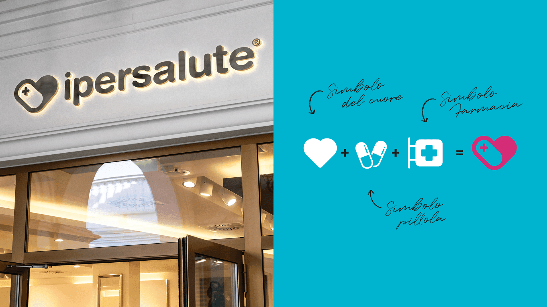
The “Ipersalute” brand identity uses a clean, minimalist design with clear iconographic elements to ensure strong recognition. The logo combines text with a heart-shaped mark formed by pill silhouettes and a cross, symbolizing a broad approach to health and personal care.
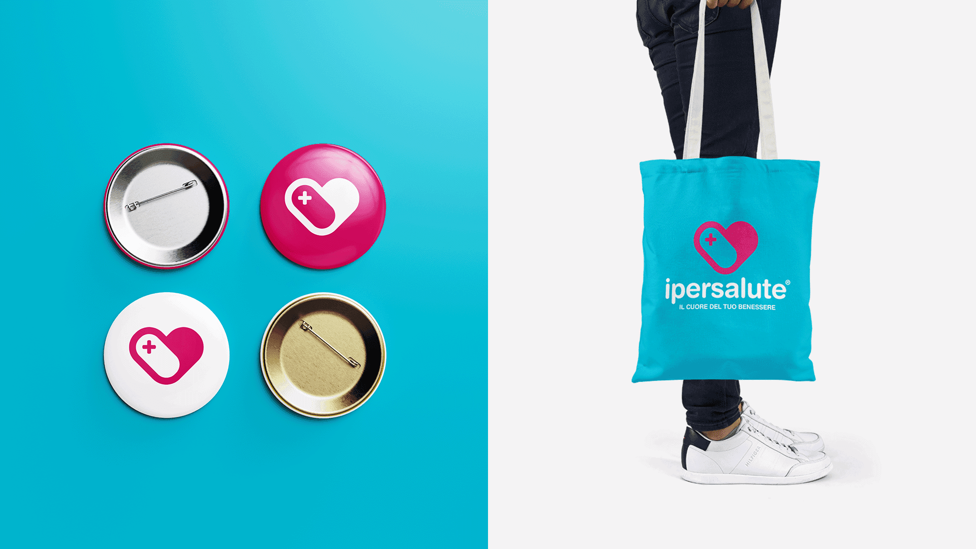
Paired with the tagline “Il cuore del tuo benessere” (“The heart of your well-being”), the identity highlights the brand’s goal: to be a one-stop destination for everything from pharmacy essentials to eyewear and wellness products.
Helvetica Rounded Bold was chosen for its balance of strength and approachability, while a soft aqua and muted fuchsia color palette reinforces cleanliness, care, and accessibility.
Scope of Work
Branding
Print Design
Web Design
Client
Ipersalute
Year
2017